Three ovals, two hearts and a steering wheel. Toyota spent about five years on the emblem it unveiled in 1989, and every curve was given a job.
- Country
-
 Japan
- Active
- Since 1937
- Founded by
- Kiichiro Toyoda
- Website
- Official website ↗
The Toyota logo through the years
-
 Until 1936 Sold as Toyoda
Early cars like the Model AA carried the family name. The AA wore a winged emblem with the kanji for Toyoda.
-
 1936 The contest winner
A public contest drew more than 27,000 entries. The winner: トヨタ in katakana inside a circle, registered as a trademark in 1937.
-
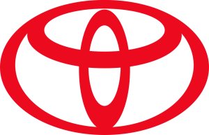 1989 Three ovals
Unveiled in October 1989 after about five years of work, first on the Celsior.
-
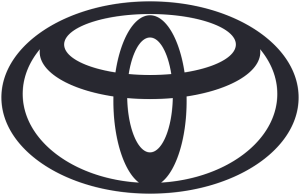 2020 Flat, no wordmark
In Europe, Toyota's communications switched to a flat emblem without the TOYOTA lettering. The cars kept the chrome badge.
From weaving looms to motor cars
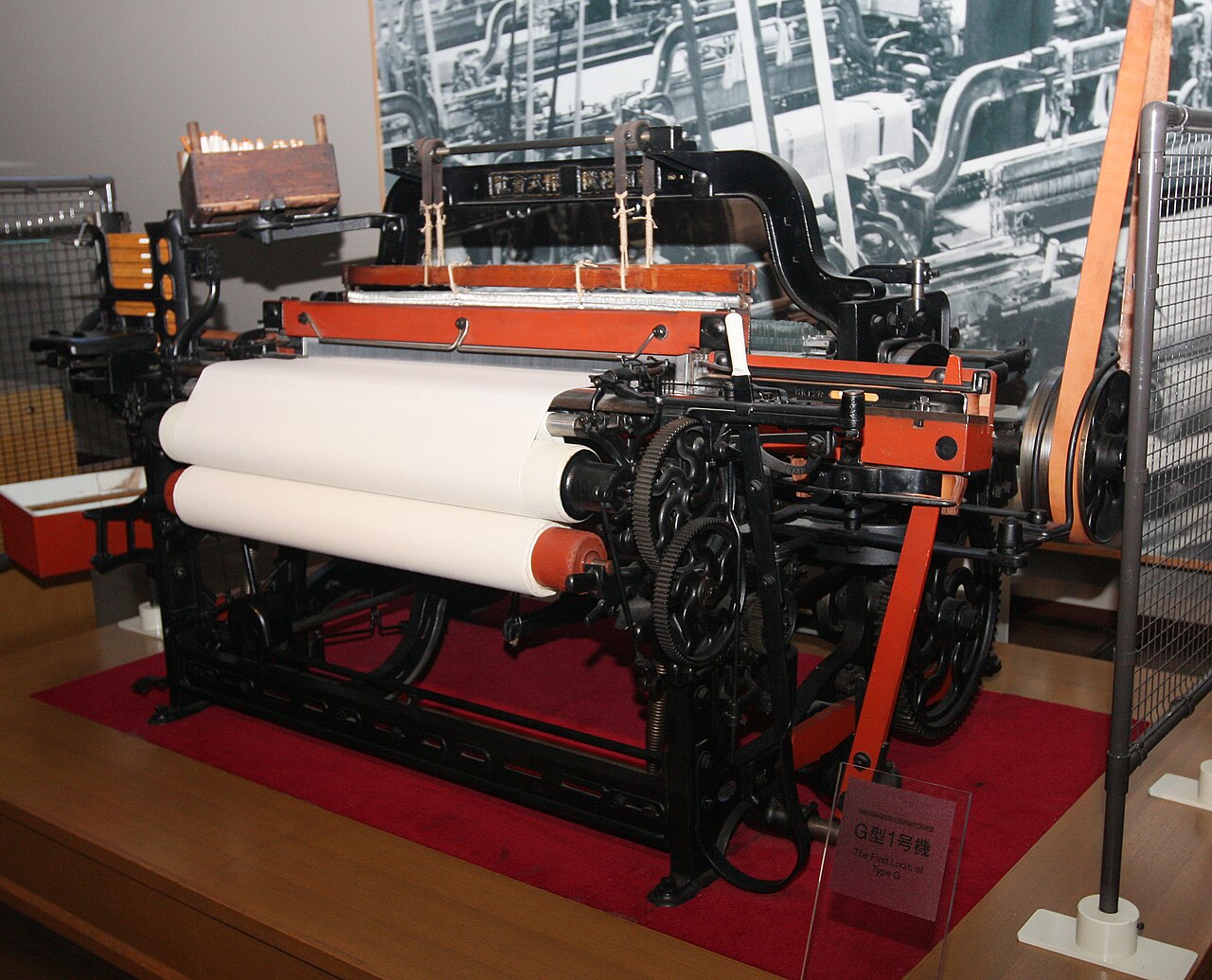
Toyota began with cloth, not cars. Sakichi Toyoda was an inventor obsessed with automatic looms, machines that could stop themselves the moment a thread broke. That simple idea, building quality into the process instead of inspecting it at the end, later became a cornerstone of the famous Toyota Production System.
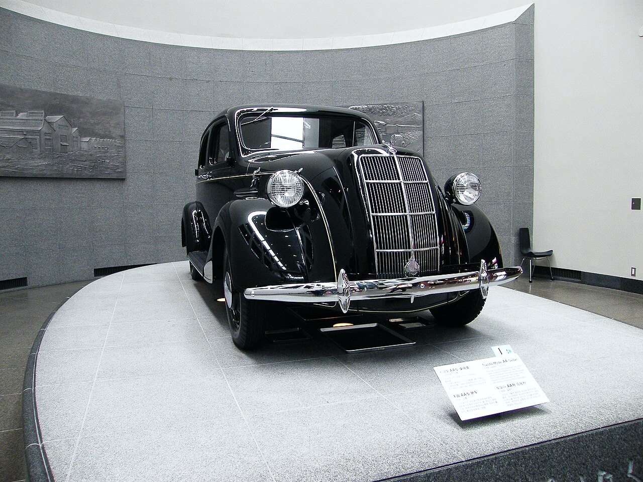
His son, Kiichiro, had other ambitions. In the early 1930s he set up a small automotive department inside his father’s loom company, took engines apart to see how they worked, and in 1936 the team rolled out its first passenger car, the Model AA. A year later the car business was spun off into a company of its own.
Why “Toyota” and not “Toyoda”?
The first cars were sold under the family name. In July 1936 the company launched a public competition for a new mark, and more than 27,000 designs arrived from across Japan. The winner spelled the name a new way, Toyota, and Toyota gives three reasons for the switch:
- It sounds clearer. “Toyota” uses a voiceless consonant, which the company describes as clearer than the voiced “d” in “Toyoda”.
- It’s lucky. Written in katakana, トヨタ takes eight strokes, and eight is associated with wealth and good fortune in Japan.
- It separates business from family. Dropping the surname marked the move from a family firm to a larger company.
The early emblems
Before the contest, the cars carried the Toyoda name. The Model AA wore a winged emblem with the kanji for Toyoda, a hint at speed, and the G1 truck had a mascot that paired the same kanji with a shachihoko, the mythical fish that symbolises Nagoya. The 1936 winner was the word トヨタ in katakana inside a circle. It was registered as a trademark in 1937. Decades later, as Toyota grew abroad, it wanted a symbol that suited its rising profile in other countries and could be recognised from a distance.
1989: three ovals
The answer arrived in October 1989, about five years after planning began, and it appeared first on the Celsior luxury saloon. That same year Toyota launched Lexus in the United States, with a badge of its own. According to Toyota, each part of the emblem has a meaning:
- The two inner ovals overlap to form a T for Toyota. They stand for two hearts, the customer’s and the company’s, and the trust between them. Toyota says the shape also suggests a steering wheel.
- The outer oval stands for the world that embraces Toyota.
- The empty space inside the logo stands for the values Toyota wants to deliver, from quality to safety.
- The stroke weights vary on purpose, a nod to Japanese brush art.
Two popular theories go further. One says you can trace every letter of T, O, Y, O, T, A in the curves. Another says the inner ovals look like the eye of a needle with a thread, a tribute to the looms. Both are fun to look for, but neither appears in Toyota’s own explanation of the emblem.
The varying line thickness is easiest to appreciate when someone draws it. The video below shows a calligrapher tracing the logo by hand, and it’s a lovely way to see the idea in action. (For more on how carmakers build their badges, see how car logos are designed.)
Going flat for the digital age
In July 2020 Toyota Europe introduced a new brand design for its communications. The emblem became a simple, two-dimensional shape, and the TOYOTA wordmark was dropped because, in the company’s words, the emblem is already well known. The cars themselves kept the familiar chrome badge.
Chrome, red and blue

On the cars themselves the emblem usually appears in chrome or silver. Away from the cars it is often shown in red, and it’s tempting to read energy or passion into that colour, but Toyota’s own explanation of the emblem doesn’t mention colour at all. Some hybrid models have worn the badge with a blue tint to set them apart from the rest of the range.
The cars behind the badge
A logo only means something because of what it’s attached to, and Toyota’s reputation was built car by car.
Landmark Toyotas, decade by decade
- 1936: Model AA. Toyota’s first production passenger car. It was sold under the family name, Toyoda, and wore the winged Toyoda emblem.
- 1951: Toyota BJ, later Land Cruiser. Developed as the Toyota Jeep BJ for a tender from Japan’s National Police Reserve, which chose a rival model. Jeep was another company’s trademark, so in June 1954 the BJ became the Land Cruiser.
- 1955: Toyopet Crown. A full-fledged passenger car that, in Toyota’s own history, attracted attention from all quarters when it arrived in January 1955. The Crown name is still in use today.
- 1965: 2000GT. The sports car shown at the 1965 Tokyo Motor Show. It needed so much careful hand finishing that Yamaha built it, away from the mass-production line, and in 1966 it set three world records in a 78-hour endurance run.
- 1966: Corolla. Launched in November 1966 to sit between the Publica and the Corona. It was the first Japanese passenger car with MacPherson strut front suspension.
- 1989: Celsior. The car that debuted the three-oval emblem in October 1989.
- 1997: Prius. Launched in December 1997. Toyota calls it the world’s first mass-produced hybrid passenger car.
- 2020: GR Yaris. Revealed in January 2020 as a homologation car for the World Rally Championship, developed by TOYOTA GAZOO Racing with Tommi Mäkinen Racing.
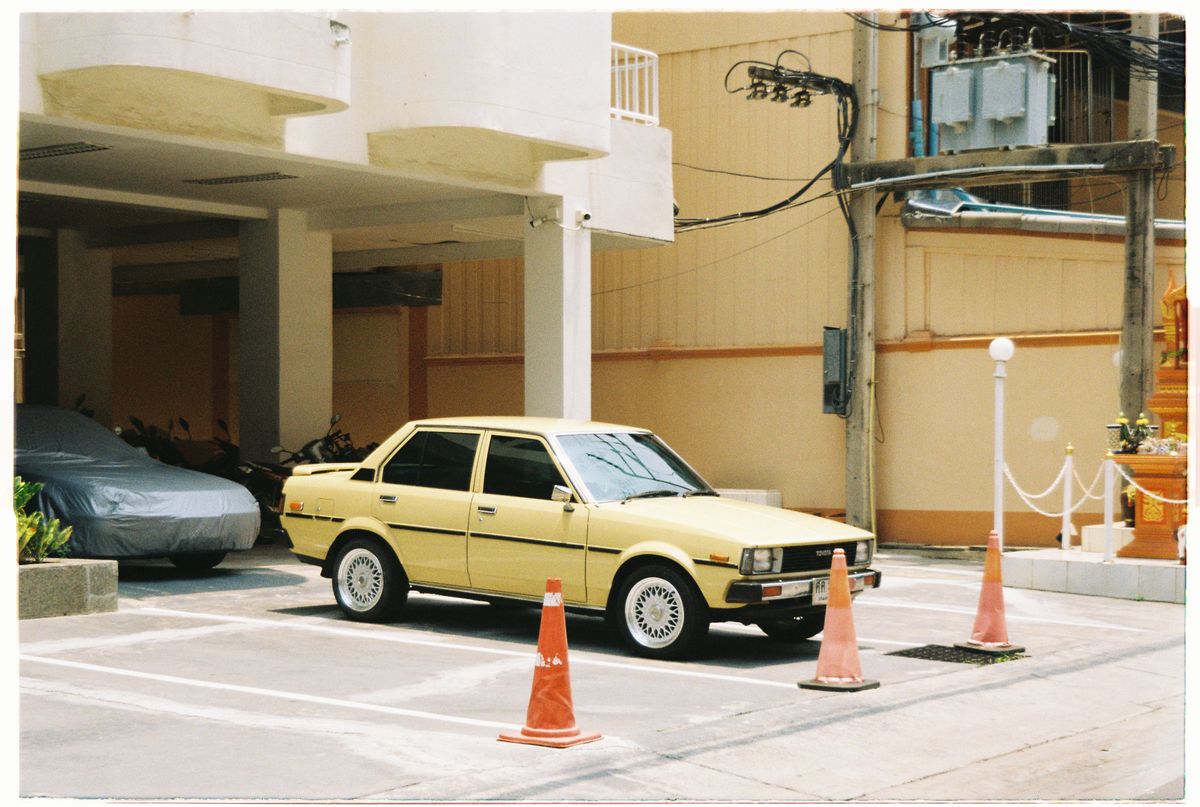
Corolla. Not flashy, just everywhere, and still on sale more than half a century later.
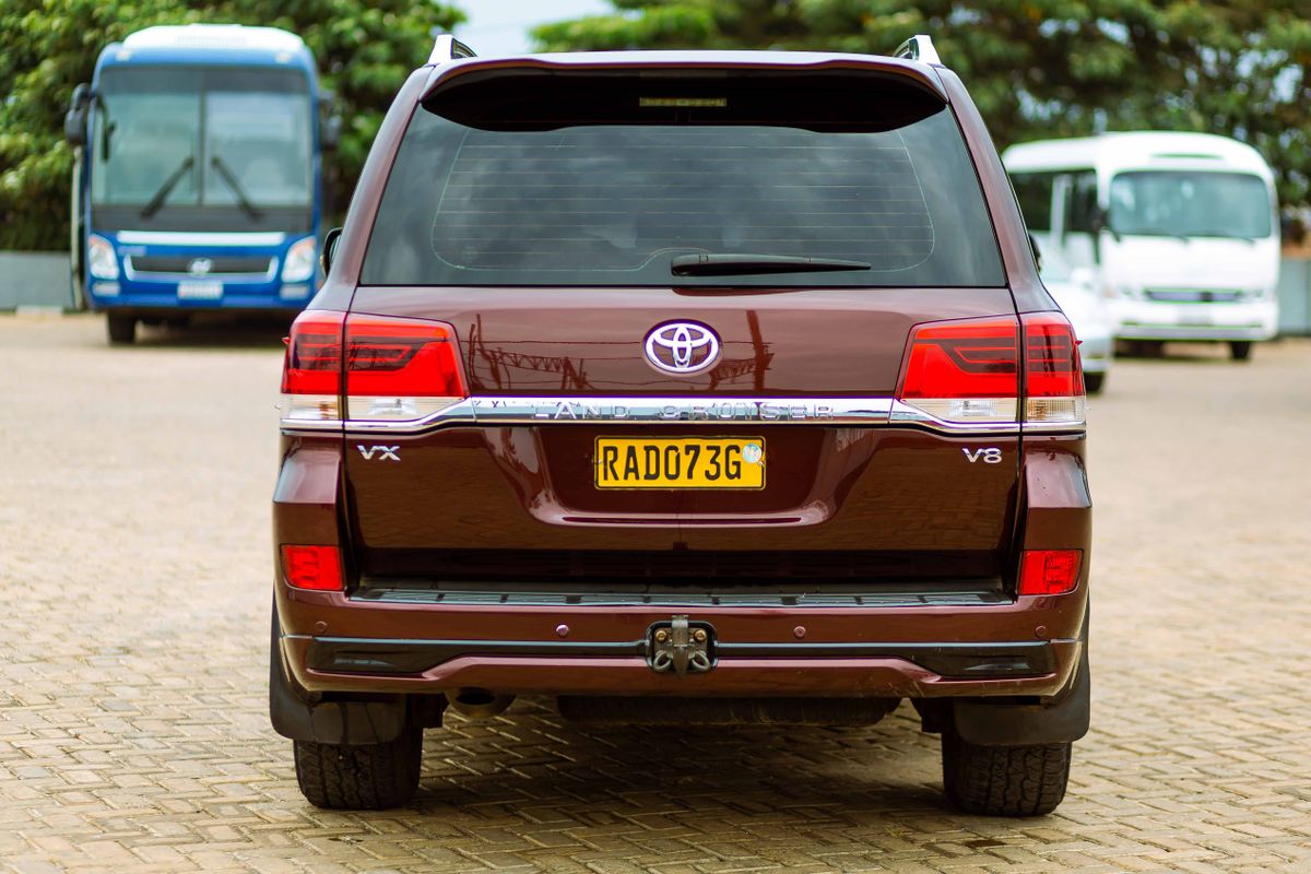
Land Cruiser. Famous for surviving deserts, jungles and conditions that defeat lesser vehicles. The Hilux pickup shares that reputation.

Prius. Here at work as a city taxi.

GR Yaris. Proof that the sensible brand can still have fun.
The wider Toyota family has its own badges too: Lexus for luxury cars, Daihatsu for small cars, and for a while Scion, a youth brand sold in North America. Toyota also works closely with other Japanese makers. The GR86 sports car, for example, was developed together with Subaru.
Frequently asked questions
What do the three ovals in the Toyota logo mean?
According to Toyota, the two inner ovals form a T and stand for the hearts of the customer and the company, and the outer oval stands for the world embracing Toyota.
Is the Toyota logo a cow?
It’s a popular joke online, and once you see a cow’s head with horns it’s hard to unsee, but no. The design is about the letter T, two hearts and the world.
When did Toyota start using the current logo?
The three-oval emblem was introduced in October 1989. Since 2020 Toyota Europe has also used a flat version without the wordmark in its communications.
Why is the company called Toyota if the founder was Toyoda?
The name changed after a 1936 logo contest. Toyota says the new name sounded clearer, took a lucky eight strokes to write in katakana, and marked the move away from a family business.
Toyota at a glance
- Founded
- 1937
- Founder
- Kiichiro Toyoda
- Country
- Japan
- Headquarters
- Toyota City, Aichi, Japan
- Parent company
- Toyota Motor Corporation
- Current emblem
- Three ovals, introduced in 1989
- Known for
- Reliability, hybrid technology, lean manufacturing
- Website
- Official website ↗
More Japanese car brands










Image credits: Loom: "1924 Non-Stop Shuttle Change Toyoda Automatic Loom, Type G" by Morio, via Wikimedia Commons, CC BY-SA 3.0; Model AA: "Toyota AA (1936)" by Emran Kassim, via Wikimedia Commons, CC BY 2.0. Other photos: Pexels.